Make teacher’s educational game managing smooth again
Overview
“My biggest fear is that we launch this and then teachers have a hard time using it... The games are good, but we want to take a methodological approach to make it easier for teacher to set up and administer expecially those who might not be tech savvy."
- Ian, CEO of Odeum
Approach
Usability Pitfalls
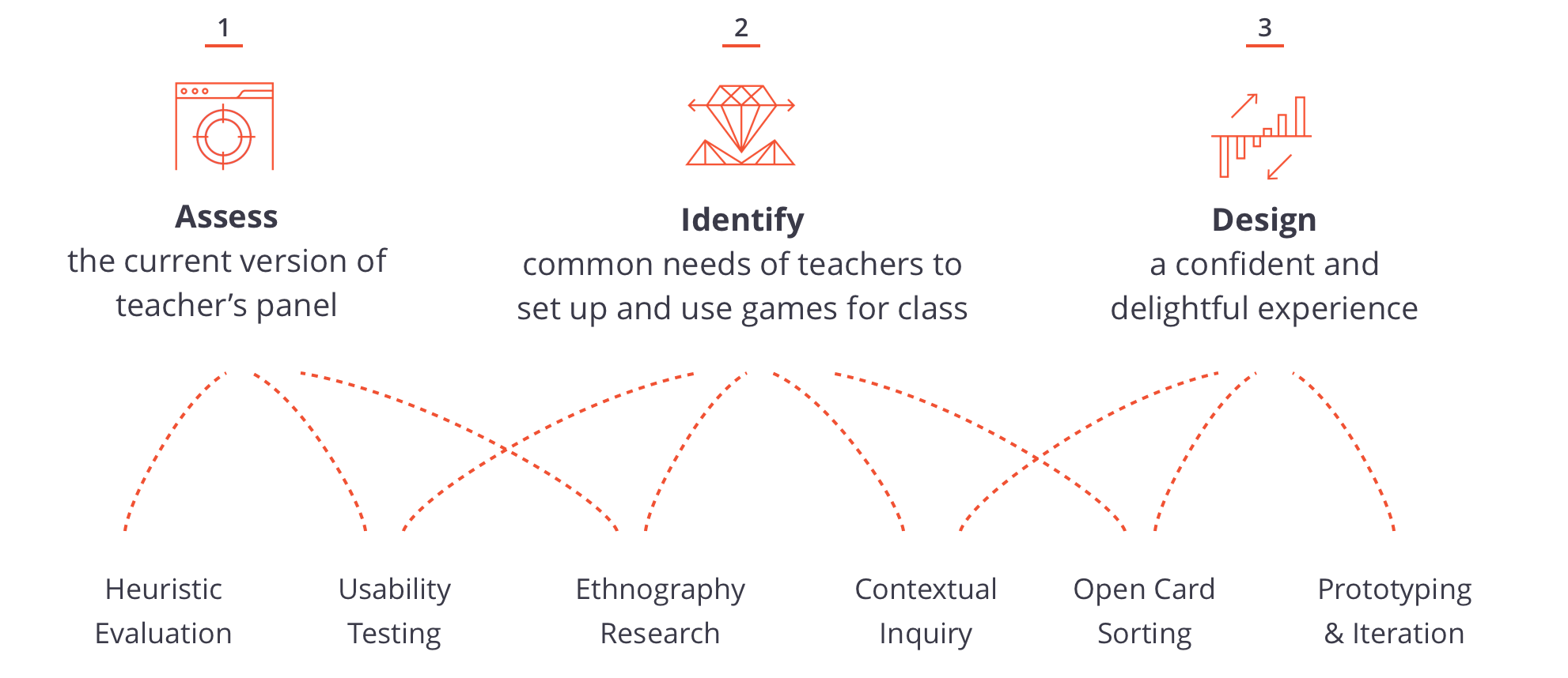
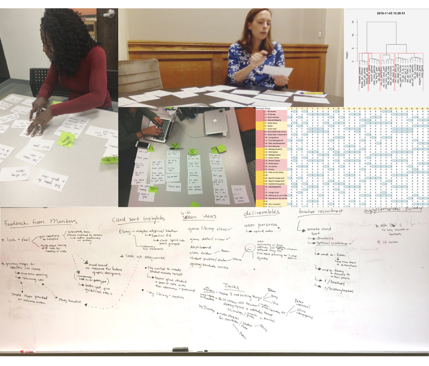
2 major usability issues with the existing version of the product popped out during our design research
Methods: Heuristic Evaluation Expert Interview Demographic Research Usability Testing
From heuristic evaluation and user testings, some severe usability issues with the existing product are identified:
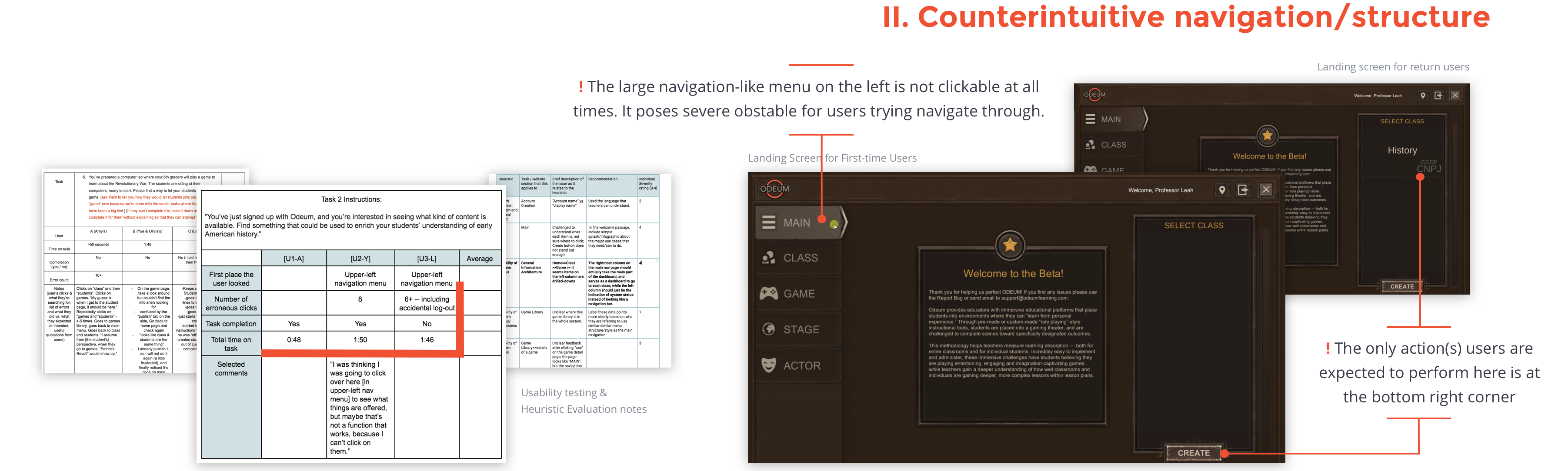
Lack of clear indication of where you are at the system
No proper feedback at some point of the system after a user perform an action
Not enough visual prompt regarding info hierarchy
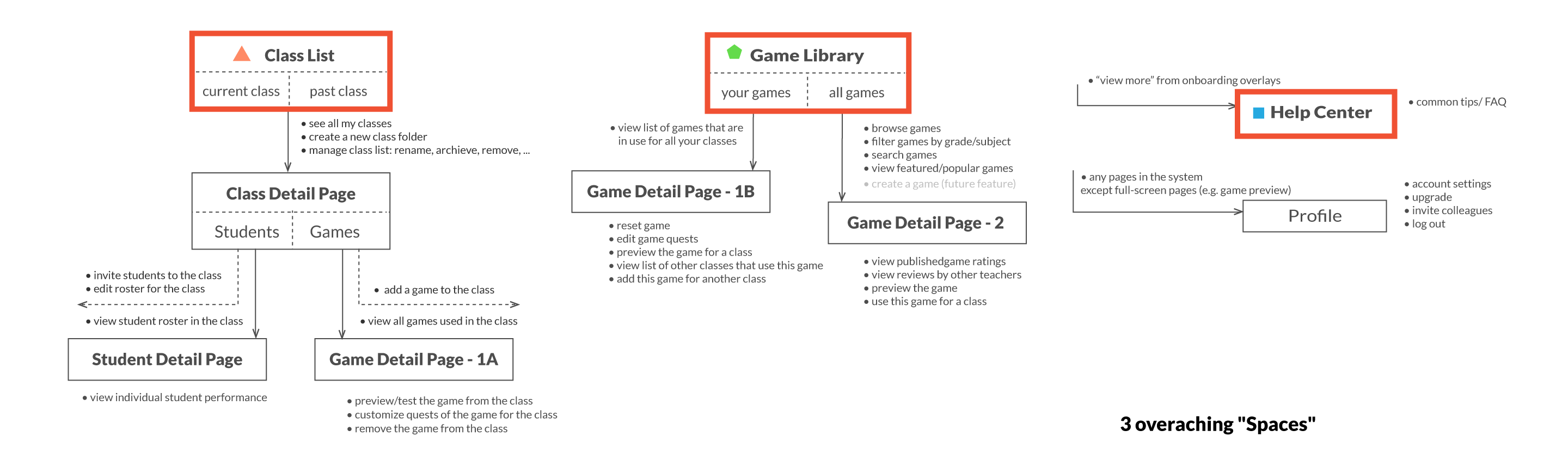
Solution Info Arch
Methods: Open Card-sorting
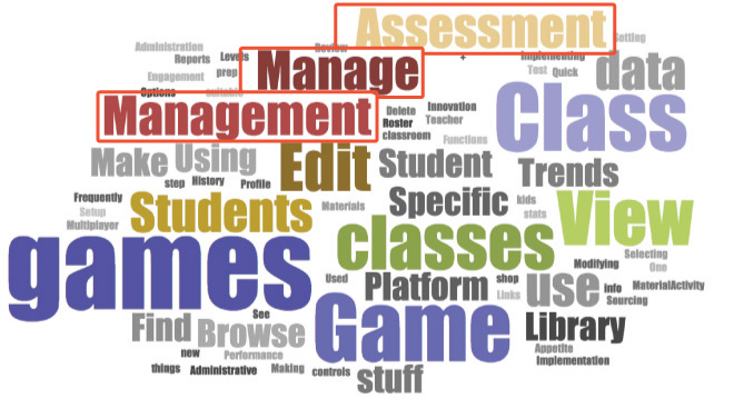
Teachers view it as an administrative tool
Word cloud generated from the group labels teachers assigned in card-sorting. Aside from "game" and "class", "Manage/Assess" is another prominent set of themes.
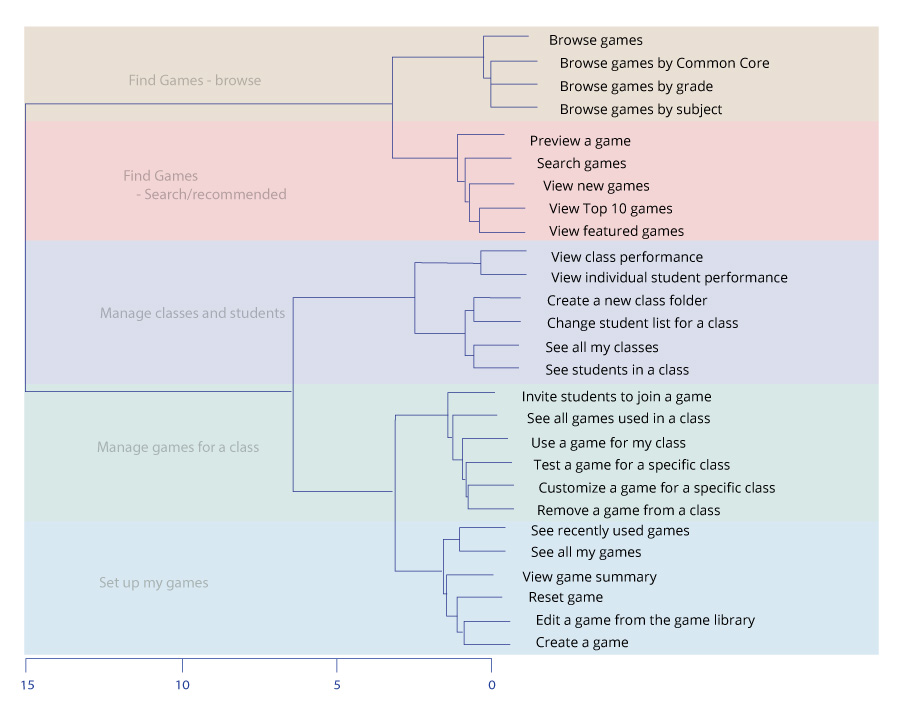
dendrogram from card-sorting created with R showing taxonomic relationship inferred by teachers mental model
Design Principle 1 & 2:
Provide teachers with comfortable paths to get where they need.
Support them to perform this task without leaving the system.
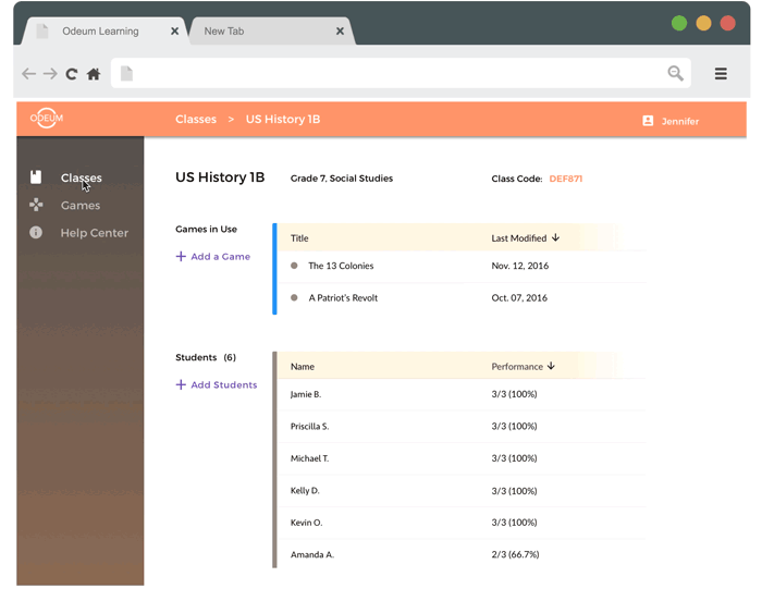
"Classes" and "Games" sections would cater to two types of teacher's behavior:
A teacher possibly already have an idea of what games can be used through word of mouth or via Odeum's website as what it is now for the company. The flow would be: create a class folder -> add game(s) to this class.
Browse the games that is available -> "Oh, this game would be useful to my xyz class" -> Use it.
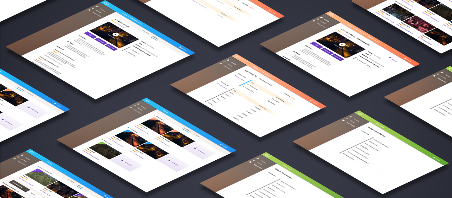
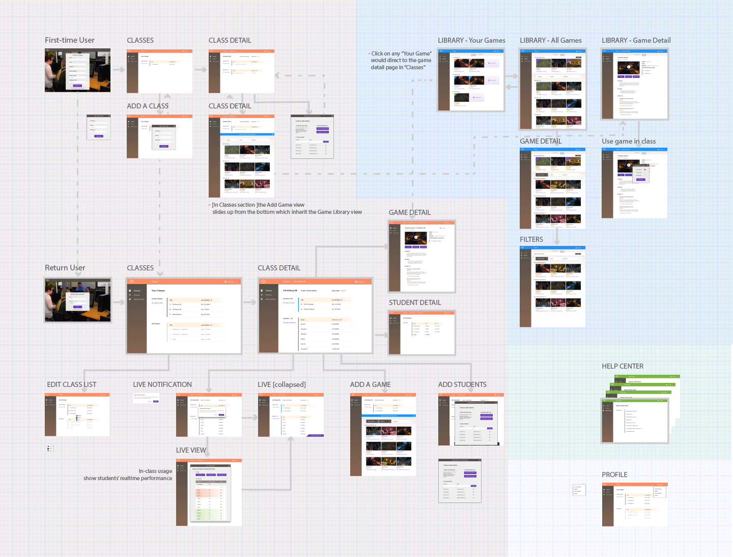
Interaction map for major screens
Solution Look&Feel
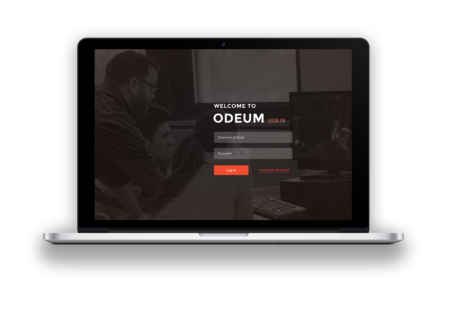
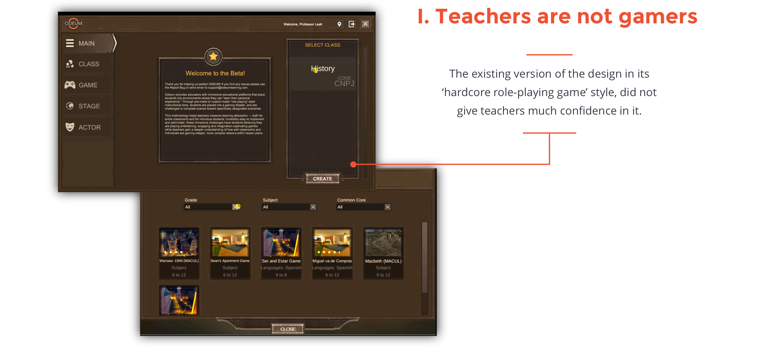
Visual design is an inseparable aspect of user experience design. It is especially significant for this project since a big barrier of the existing version for targeting user teachers is the slightly intimidating gaming look of it.
As teachers view it as an administrative tool, our idea is to avoid the gaming feelings and create an approachable and organized feel. The biggest challenge is to help teachers who think themselves as not tech-savvy find confidence in using technology in class when using this product.
Design Principle 3:
Finding an interface that brings back teachers' confidence.
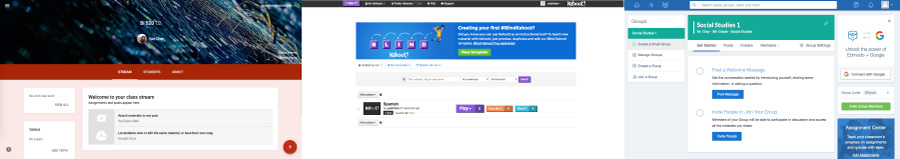
From our design research, we found that teachers all are familiar with Google's product, even for those who claimed that they are non-tech-y. Google Drive and Docs were the most common digital products that teachers used for work.
Comparative Products: looking into other educational games/tools like Edmodo, Google classroom, and Kahoot also helped define the visual style of the product.
Experience with Material Design
I was really excited about my first time applying Design principles of Google Material Design. My favoirte part has to be the animation: spatial relationships, functionality, and intention of the system. Although I am still fairly new to motion design prototyping, I had a goood time trying it out myself.
"A material metaphor is the unifying theory of a rationalized space and a system of motion. Our material is grounded in tactile reality, inspired by our study of paper and ink, yet open to imagination and magic.” - Google Design
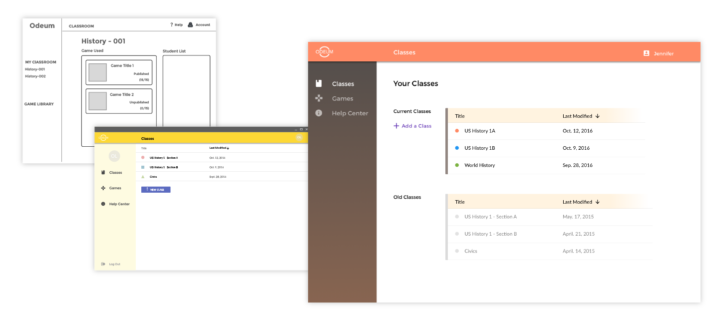
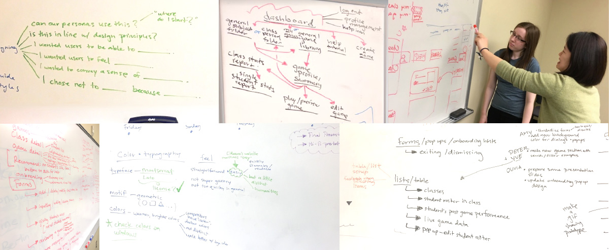
Class List Page Iteration
To really provide teacher with an approachable interface, I aimed to key mood of "organized, clean, trustworthy".
Because teachers feel natural and comfortable using Google's product and also, the state of Michigan is proposing teachers to all use them, we decided to model after some Material Design guidelines.
Meet the Unmet Needs
Methods: Contextual Inquiry Rapid prototyping
A need to "jump on and play"
The actual concern of a teacher to start using an educational game is not only the own level of tech-savvy, but the time that it takes for them to get the idea and get to the point that they can use it in classroom.
I kept this requirement for usability in mind when designing the experience and cleared out the roadblocks in the product's onboarding experience, so that teachers could pick it up easily.
"Teachers only have an hour or so prep time. They need to quickly know what’s going on on your product, in the end can take information and put it in a report card."- Sean, teacher at Wyandotte Roseville High School core member at Odeum
Track your students' real-time performance in class
From the interview we learnt that, teachers concern about the in-class game experience. They want to make sure that all their students on track. Besides, they don't want technology to faile them in front of a group of kids. Thus, we have proposed a Live feature.
Once a first student logs into the game, the teacher would get immediate notification, and he/she can view live status in a popup window or it will be minimized to a bottom status bar with the number of students that are currently online.
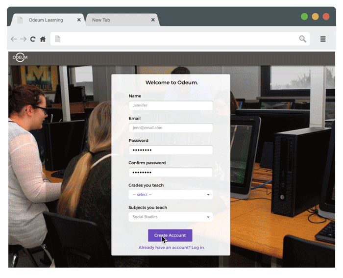
Have a sample class sitting there waiting for them
Corresponding to the need to easily pick up, first time users will see an sample class after they create an account, which they can directly edit from. This would allow them to get to game selection or class set-up part straightforwardly..
In Game section, there will also be callouts to guide first-time users through for example, the subject and grade filters.