Info Visualization
I enjoy the process transforming data into something interactive, making it more meaningful, understandable and beautiful. Below are three different fun projects I did experimenting with information visualization
1
Hoffman Coding
As an communication engineering undergrade, one biggest challenge for me is to visualize and digest the concepts of abstract algorithm. By learning infoviz, I found interactive visualization would greatly help, especially for right-brainer or non-major. In this project, my goal is to develop a mini-site using interactive visualizations to support learning the how a snippet of characters are encoded with Hoffman algorithm and thus compressed.
View it Live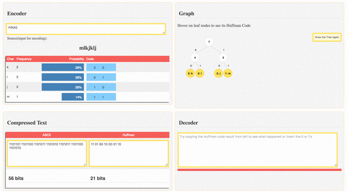
2
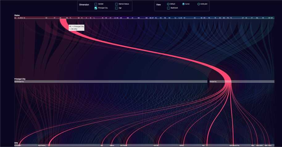
How Americans Engage with Art?
An analyst tool for participation over different states, and different art categories.
The analyst can also choose parameters such as genter, maritual status, priciple/not principle city, and age
to view data and compare.
3
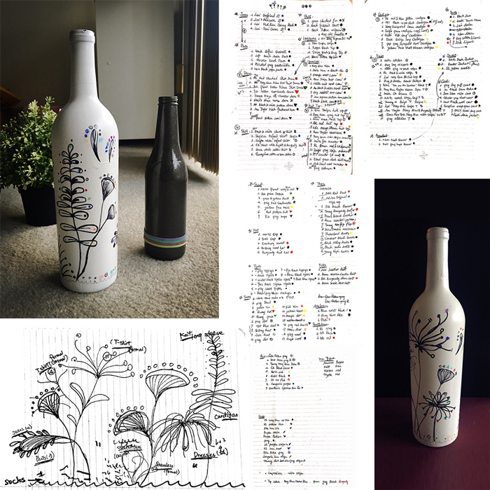
How big is your closet?
This is an experimental project using interesting medium to visualize data.
I am sure you don't want a pie chart. How about a disc?
or a wine bottle!
Inspired by Dear Data I took and artist approach to draw out a visualization of my wardrobe. I took a Saturday morning to get all my clothings sorted and tracked down, grouped them and encoded them by color, shape and location in the form of peculiar plants and its branches and leaves.